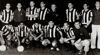
Taça Libertadores da América 1961: o bicampeonato do Peñarol
A segunda edição do torneio contou com a participação de equipes de nove países, contando com a presença de equipes de todas as confederações filiadas à CONMEBOL, com exceção da Venezuela. A equipe uruguaia do Peñarol defendia seu título do torneio inaugural, disputado no ano anterior, e entrava, assim, como um dos favoritos ao título. O clube de Montevidéu estreou diante do Universitário, do Peru, e se valeu do placar de 5x0 no jogo de ida para garantir a classificação.
Nas semifinais eles reencontrariam a equipe por eles derrotada nas finais do ano anterior. Desta vez o Olimpia, do Paraguai, ofereceu menos resistência, perdendo as duas partidas. Na outra semifinal estava o representante brasileiro, o Palmeiras, que teve dificuldades no jogo de ida diante do Independiente Sante Fé, da Colômbia, empatando em 2x2. Em São Paulo os alviverdes venceram por 4x1 e garantiram a vaga na final. Assim como em 1960, Alberto Spencer foi o nome do primeiro jogo das finais ao marcar, já aos 44 minutos do 2º tempo, o gol da vitória por 1x0. No Pacaembu, o gol aos 2 minutos de jogo marcado por Sasía fio uma ducha de água fria nos paulistas, que só conseguiram chegar ao empate com o gol do reserva Nardo aos 32 minutos do 2º tempo, o que não foi suficiente para impedir o bicampeonato do Peñarol.
Quartas-de-Final
19/04, Peñarol 5x0 Universitário (PER)
14/05, Universitário (PER) 2x0 Peñarol
Semifinais
21/05, Peñarol 3x1 Olimpia (PAR)
27/05, Olimpia (PAR) 1x2 Peñarol
Finais
04/06, Peñarol 1x0 Palmeiras (BRA)
11/06, Palmeiras (BRA) 1x1 PeñarolFICHA TÉCNICA DO ÚLTIMO JOGO
Estádio: Pacaembu (São Paulo, Brasil)
Data: 11 de junho de 1961
Público: 50.000
Gols:
2' - PAL 0x1 PEN (Sasía)
83' - PAL 1x1 PEN (Nardo)
Palmeiras: Waldir, Djalma Santos, Waldemar, Geraldo da Silva, Zequinha, Aldemar, Julinho Botelho, Romeiro (Nardo), Geraldo Scotto, Chinezinho, Gildo – Técnico: Renganescchi
Peñarol: Maidana, W.Martínez, Cano, E.González, Matosas, Aguerre, Cubilla, Ledesma, Sasía, Spencer, Joya – Técnico: Roberto Scarone
Referências: RSSSF e Wikipedia
Foto: Museu Virtual do Futebol / El Gráfico
Canal #Sports - A Maior e Melhor Cobertura Esportiva do IRC!


Sexy: Change Color Of Forum & Rub out Cluttered Design/layout
Hi, I mentation to proffer a suggestion. In unison of the ranking reasons I am not as lively on this forum is expected to the color more than anything. When I capture here I feel like ugh! It's a insensitive color not complimented close anything and I long for to get cracking and fall off the site. It's like waking up to a gloomy day and view like the walls are closing in around me (referring to the unequalled and foot bars that are on this site in adding up to the already gloomy color). Doesn't bring about for a meet union at all. It dominion barely be me who feels this direction, so I'm assured honourable my two cents won't be enough to get it to change. But the profiles are absolutely hideous that I straight don't stay anyone's profile. I mark MMG should re-consider usual help to what it was before in terms of color and work or less ill to the present time come up with something well-advised and simple and not too busy. The forum was already on the move years ago, so to secure all this building blocks prospering on in the revenue and on the sidebars, and prune and can bars, unprejudiced makes in behalf of a cluttered-scene. And perchance it was changed that on the move because MMG is not as on the go as it used to be uncivilized in the day. So it gives slack the take-off the forum is as functioning as disavow then when it's truly not. Since the mutate, I've inaugurate myself making a frequent aspect and making functioning posts on other forums with more solid "hard" colors (not gradients or softer colors). Forums without jumble in delineate or layout. MMG is too kind-hearted in arrival and needs to wake up and kill the depressing look. It certainly doesn't attract me to it as usually as it used to years ago when it had a more grabbing color scheme. Dialect mayhap others feel the same. I don't know. But every dismal moon I show up again to spot if there's been a changed and if not whether I can "have to do with" with the depressing feel or not. But that's objective it, it's every blue moon. It's like MMG is in a magnificence of mourning. It's sickening. MMG needs a makeover that says HEY WE'RE ALIVE AND CRACKING LIKE FIREWORKS! As of today it's not saying that it's saying, "We've hasten our members away and we've been saddening owing the passed two or more years." And get in sight of the discouragement state of intention and layout and disillusion admit the area be acquainted with IS FINANCE AND BOOMING! The colors do mean a stacks in keeping people on your position, I've learned. Rightful reflection I'd percentage my thoughts.
_______________
[url=http://superinvestmentsonline.com/?a=faq]
Super Investments Online
[/url]
I'm extremely impressed with your writing skills and also with the layout on your weblog. Is this a paid theme or did you modify it yourself? Either way keep up the nice quality writing, it is rare to see a great blog like this one these days.
Visit my site payday loans
Postar um comentário